Air Maestro allows you to create custom tabs to capture the required information for each safety report type. Tabs can be unique to each safety report type (e.g. Mechanical Fault tab) or common to all reports (e.g. Report Details tab).
...
Air Maestro allows you to create custom safety reports to capture the safety events relevant to your organisation. Before you can commence setting up custom tabs and fields for each safety report type, you must ensure the report type (Fatigue, Environment, Flight etc) is created. Refer to Setup safety report typesin this guide for instructions on creating a new report type.
Step-by-step guide
- Select Safety > Setup > Safety General → Setup → Safety Custom Fields. The Safety Form Setup screen is displayed and all the current tabs are listed in the grid.
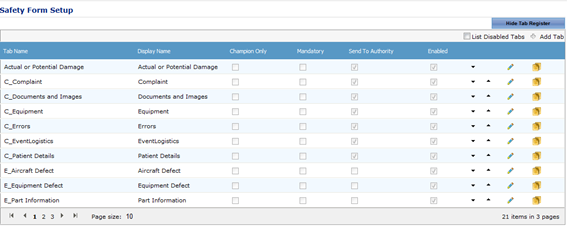
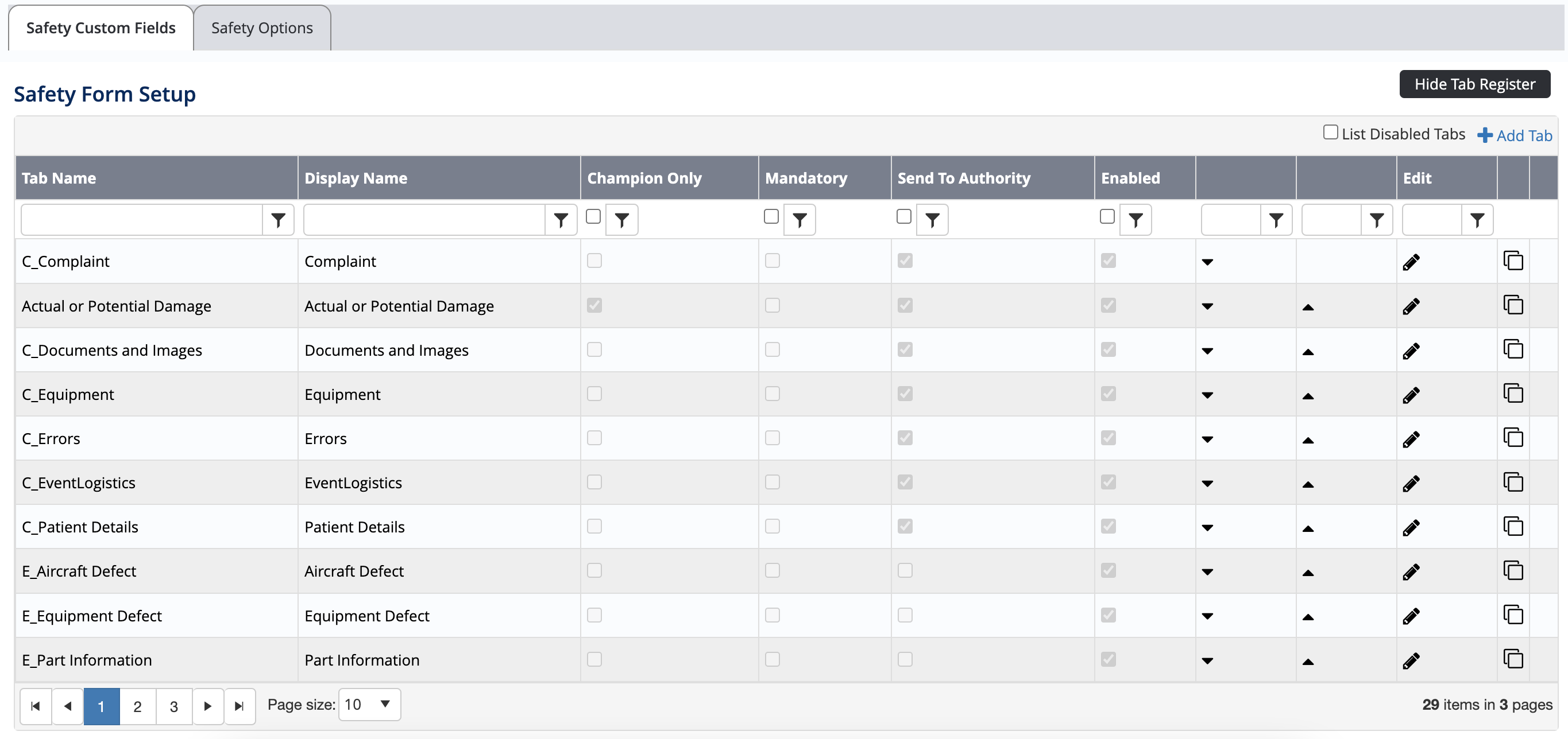
Click [+Add Tab]. A new row is displayed in the grid.


Complete the tab details as required.
 The Champion Only, Mandatory, Send To Authority and Enabled tick boxes are the default values for the tab and can be altered for each safety report type to suit individual reports.
Field
Description
Tab Name
Enter a unique identifier for the tab. For example, if you are creating a tab which is used only for an ‘Environmental’ safety report type and relates to weather conditions, you may name the tab in the format: reportid_weatherconditions. If the report id for an ‘Environmental’ safety report is ‘V’, the tab name could be v_weatherconditions.
Display Name
Enter the name that is displayed for the tab. For example, Weather Conditions.
Champion Only
Select whether the tab can only be completed by the champion/investigator. If this tick box is unselected, the reporter can complete the tab.
Mandatory
Select whether the tab is mandatory when completing the safety report. If this tick box is unselected, the reporter can skip the tab.
Send To Authority
Select whether the tab is sent to the authorities, when given the option. If this tick box is unselected, the information on this tab is not sent to the authorities.
Click [
 ]. The grid is updated with the new tab.
Select the newly created tab in the Select Tab drop-down list.
[Add New Field].
 You must create a group prior to setting up new fields for the tab. By setting up a group, you can select the layout options for the fields within that group.
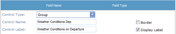
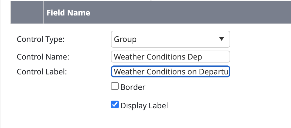
Select ‘Group’ from the Control Type drop-down list.
Enter the group name in the Control Name text box. This name is used to store the custom group field in the database. Special characters such as (?,/ etc) are not allowed in this field.
Enter the group label in the Control Label text box. This label is displayed to the reporter.
Select the Border tick box to include a border around the group field.
Select the Display Label tick box to include the label entered in the Control Label text box for the group field.
Complete the Options pane for the group as required.
Field
Description
Display Mode
Select the display mode for the group field. The ‘Flow’ display mode attempts to fit all the custom fields as close together and as neatly as possible. The ‘Table’ display mode displays each custom field one after another depending on the direction.
Direction
Select the direction in which the custom fields are displayed.
Number of Columns
Select the number of columns that are contained within this group.
Label Width
Enter the width of each field label within this group.
Alignment
Select the required alignment of fields within this group.
Display Options
Select the display option for the group field.
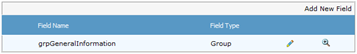
Click [Insert]. The grid is updated with the new group.
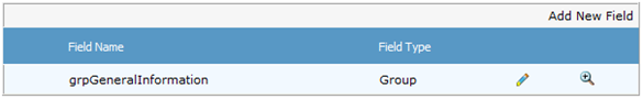
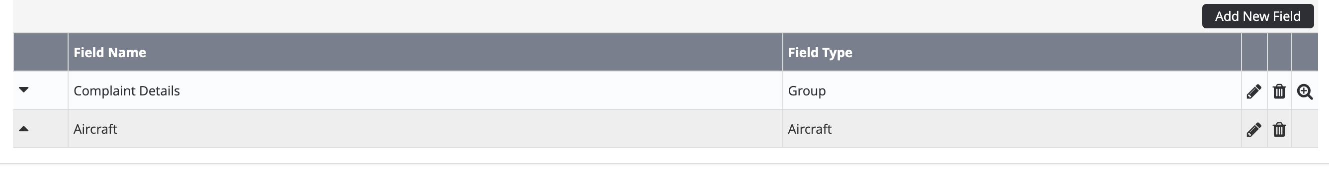
Click [
 ] or use the Hierarchy drop-down list to view/expand the custom field group.
Click [Add New Field] to add a custom field to the group.
Select the required field type from the Control Type drop-down list.
Field
Description
Aircraft
Displays a drop-down list of every aircraft within the system.
Autonumber
Displays an automatically generated number starting from a base number and prefix.
Calculated Field
Displays a calculated value based on a formula involving other custom fields. For example, you may create an ‘Age’ calculated field, which outputs a numeric value based on an entry in a ‘Date of Birth’ custom field.
Checkbox
Displays a tick box that enables the user to select from true/false or yes/no options.
Checkbox List
Displays multiple tick boxes that enable the user to select one or more items.
Contact Picker
Displays a selectable list of contacts as entered in the contact register (Operations > People > Contacts).
Cumulative Time
Displays a text box which enables the user to enter an amount of time.
Date Control
Displays a picker that enables the user to select a date.
Date Time
Displays a picker that enables the user to select a date and time.
Drop-Down List
Displays a predefined list that enables the user to select a single item from the list.
Group
Groups multiple custom fields under a single heading.
Label
Displays a line of text.
Nested Drop Down List
Displays a series of interconnected drop down lists (up to 3). Typically used for location data (Country, State, Suburb).
Numeric
Displays a text box which enables the user to enter numerical data.
Personnel
Displays a drop-down list of all personnel within the system and when a user is selected, further information is displayed about the selected user (Contact Details, Company Details, Pilot Details or Crewmen Details).
Personnel Picker
Displays a list of personnel names currently active in Air Maestro by Department, Base/Department, Base or Name.
Radio Button List
Displays multiple radio buttons that enable the user to select a mutually exclusive option.
Text
Displays a text box which enables the user to enter text data.
Time
Displays a text box which enables the user to enter time data.
Tree
Displays a hierarchal tree structure.
Upload
Displays the upload control allowing users to upload files.
Complete the field options with the required settings.
Field
Description
Control Name
Enter the unique identifier for the custom field in the Control Name text box. This name is used to store the custom field in the database. Special characters such as (?,/ etc) are not allowed in this field.
Control Label
Enter the display name for the custom field in the Control Label text box. For example, you may enter a more descriptive name than that entered in the Control Name field as this field is displayed in the interface.
Border
Select the Border tick box to include a border around the field.
Display Label
Select the Display Label tick box to include the label entered in the Control Label text box for the field.
Complete the Options pane for the custom field as required.
(The options vary according to the selected custom field. For example, for the ‘Drop Down List’ control type, you must specify if the field is required, the list items and if the field is always displayed. For the ‘Text’ control type, you must specify if the field is required, if a multi-line text box is required, the dimensions of the multi-line text box (if applicable) and if the field is always displayed). The Display Options field allows you to specify when the field must be displayed. The default is ‘Always’, but if you click the ‘Always’ text a dialog box is displayed which allows you to set the view rules for the field. For example, if you had a field for ‘Delays’ you may wish to display a ‘Description’ text box only when the ‘Delays’ field is selected.
Click [Insert]. The grid is updated with the new custom field.
 A preview of the custom field is available in the Preview pane. To modify the field, click [
 ], edit the required options and click [Update].
Click [
 ] or use the Hierarchy drop-down list to view/expand the custom field group. To add additional custom fields within the group field, repeat Steps 15-19.
Select root from the Hierarchy drop-down list to view/retract the custom field group and to add additional custom fields outside of group field.
...